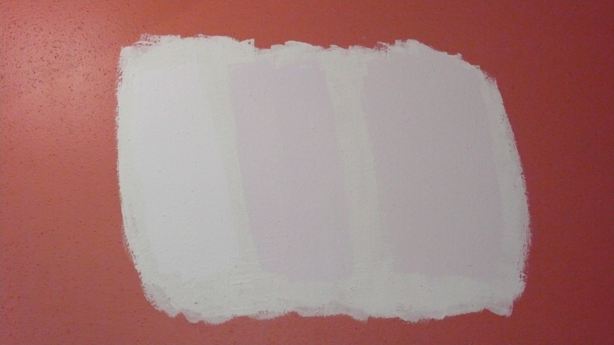
When we moved in, the master bedroom was painted in a seafoam green color. Dirk and I both disliked it, so we decided to repaint. I looked for a warm, rustic color and ended up choosing Chrysanthemum by Sherwin-Williams. I thought it would be nice and autumnal; unfortunately we ended up with pumpkin orange. In hindsight, I probably should have gone more a more reddish color but I was worried about it turning out too dark.
Don’t get me wrong, I really like orange–Go Illini! However, as soon as the paint was up on the wall, we knew it was wrong. I lived with it for about a year, but I’m tired of feeling like I’m putting on my makeup inside a jack-o-lantern.
I’m thinking of going with a sophisticated grayish-violet color this time. I was inspired by a picture in House Beautiful magazine that showed a bathroom done in all black and white tile with lavender walls. The perfect color would be something with a hint of warmth (not pink!), but much lighter and less intense than the orange.
We’re currently leaning toward Majestic Mauve by Benjamin Moore. It is the color on the far right in the photo. The other two colors are Dreamy Cloud and Touch of Gray. The first is too light and fairy princess-ish, the second is too strong of a purple. We’re hoping to finally get this just right. Anyone have any other color suggestions?